Leave your e-mail address. We will contact you
Mazowiecka 26
81-862 Sopot, Poland
kontakt
@yoiomi.com
NIP PL7671537452
Leave your e-mail address. We will contact you
Mazowiecka 26
81-862 Sopot, Poland
kontakt
@yoiomi.com
NIP PL7671537452
Privacy Policy
Cookie Settings
© 2026 YOIOMI Studio. All rights reserved.
Warning
To enter the site you must be 18 years old.
The site contains content related to alcoholic beverages intended only for adults.
Are you 18 years old?

Or maybe you just want to draw us something?
Go ahead – write, sketch, share.
Some of the best things start just like that.

Looking to join the team?
Whether it’s a job, an internship, or just a good feeling
we’re always open to meeting great people.

Got a project and need a quote?
Tell us about it – straight and simple.
We’ll get back to you quickly, no fluff, no nonsense.

Let's stay in touch
Give us your phone number or email address and we will contact you in less than 8 hours!

Thank you for getting in touch. We will contact you in less than 8 hours!

MAXLIGHT CI
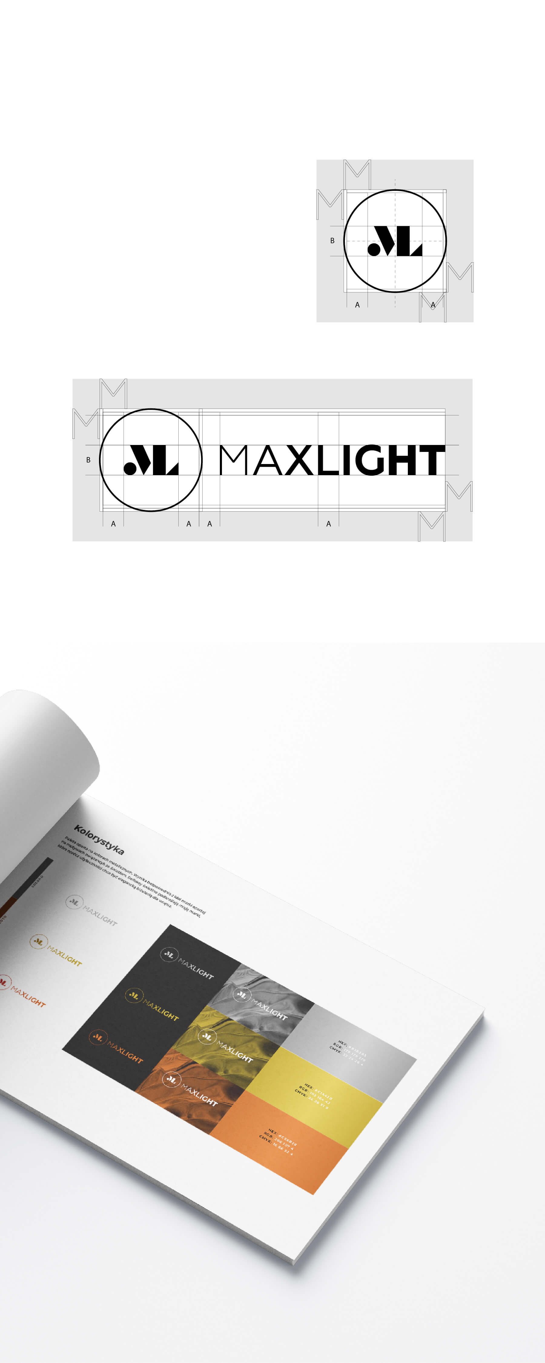
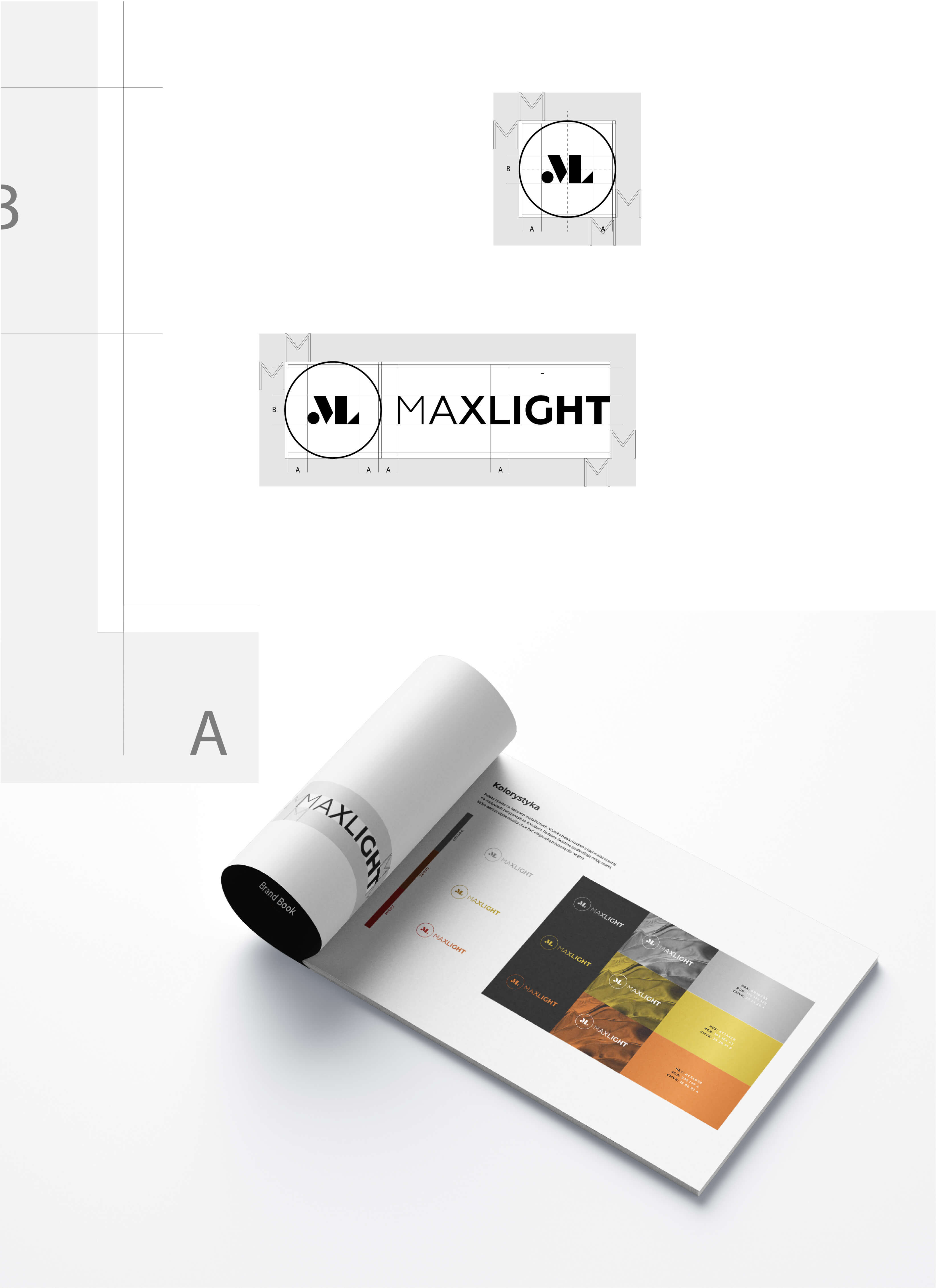
The key elements of the sign's structure are based on two modules A and B for horizontal and vertical orientation. The protective field is marked by a firet in the form of the letter M. For greater harmony, in addition to mathematical measures, optical corrections have been applied, mainly within the circle line of the signet ring, as well as in the kerning of the typography itself to organize the weights and lights.
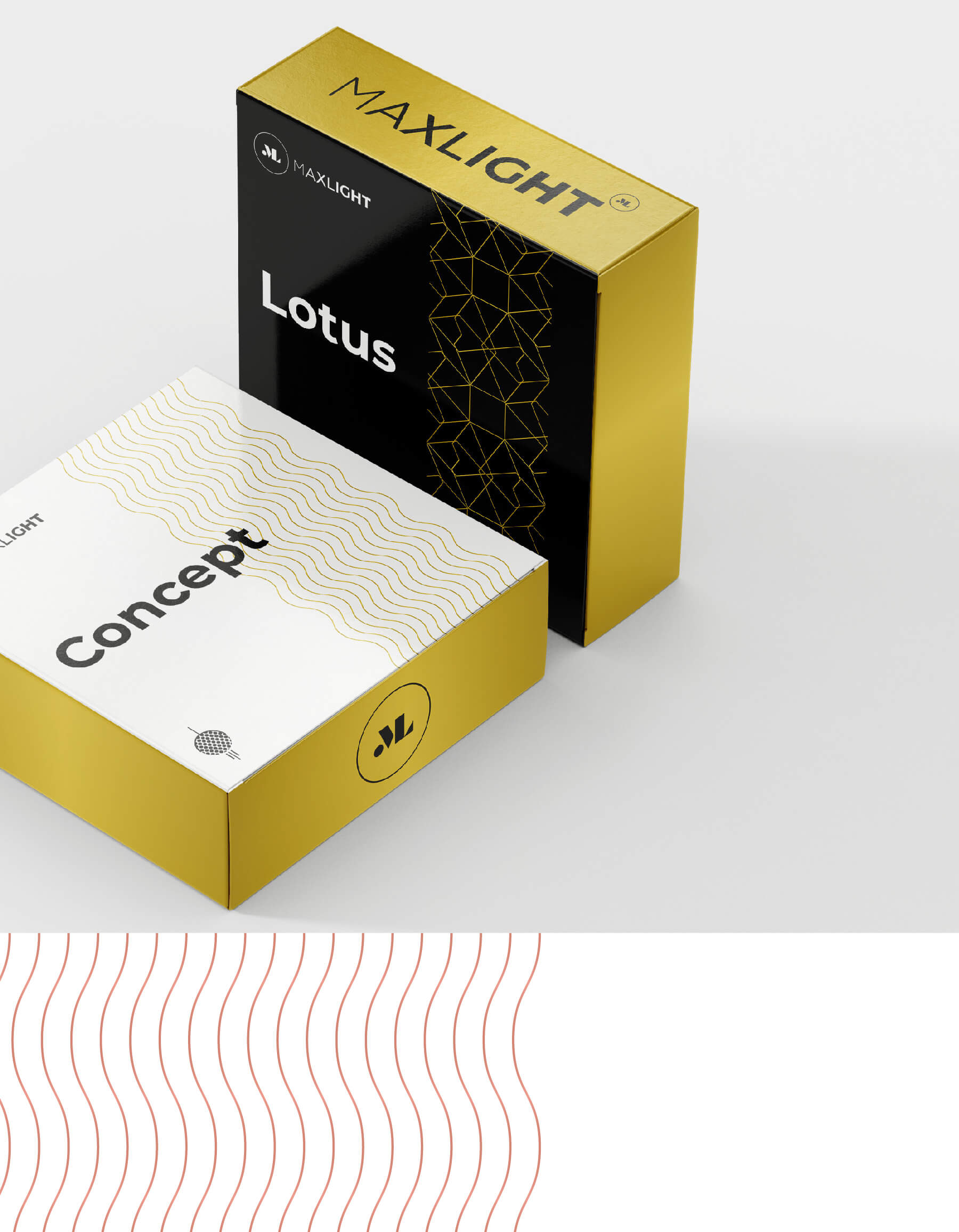
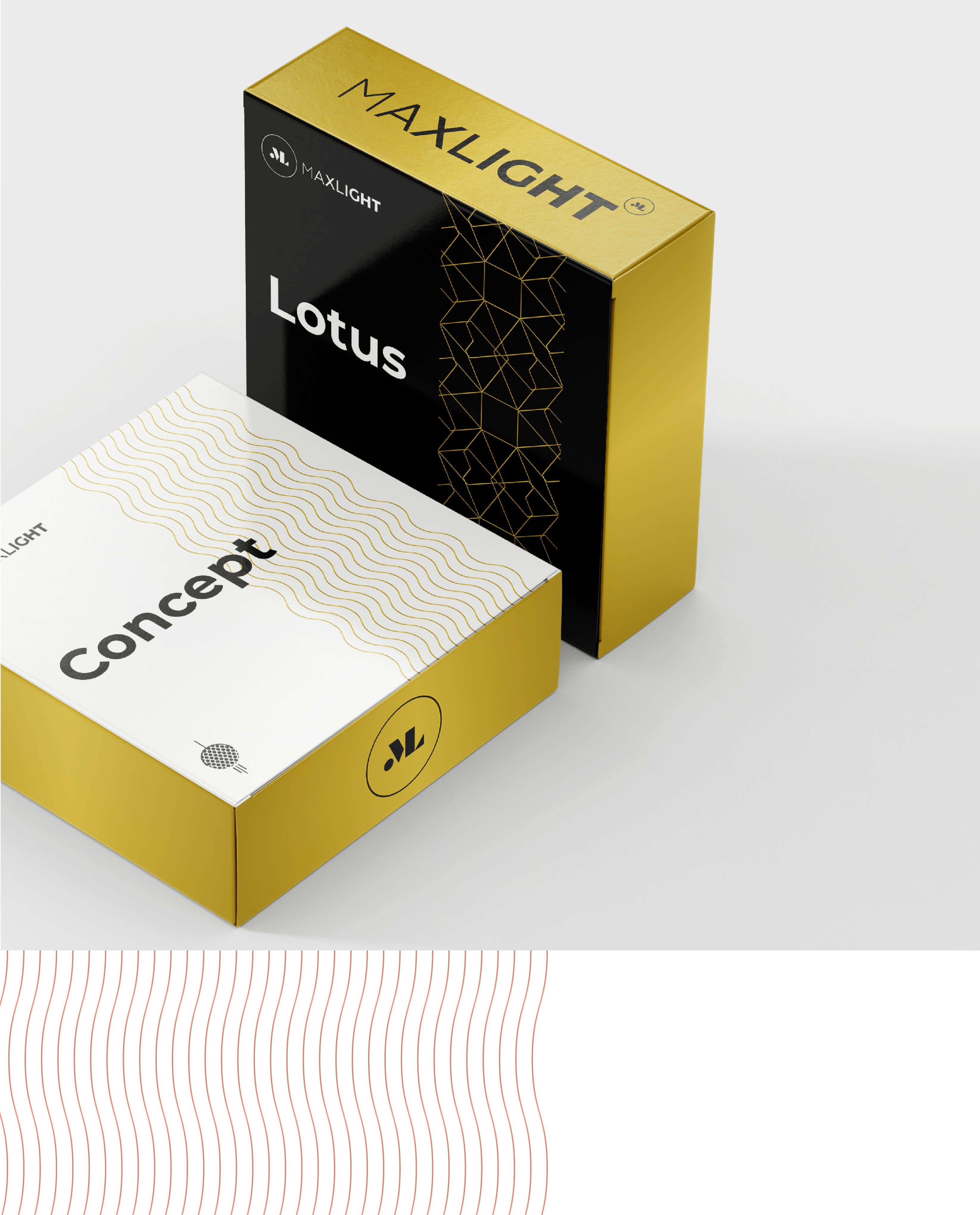
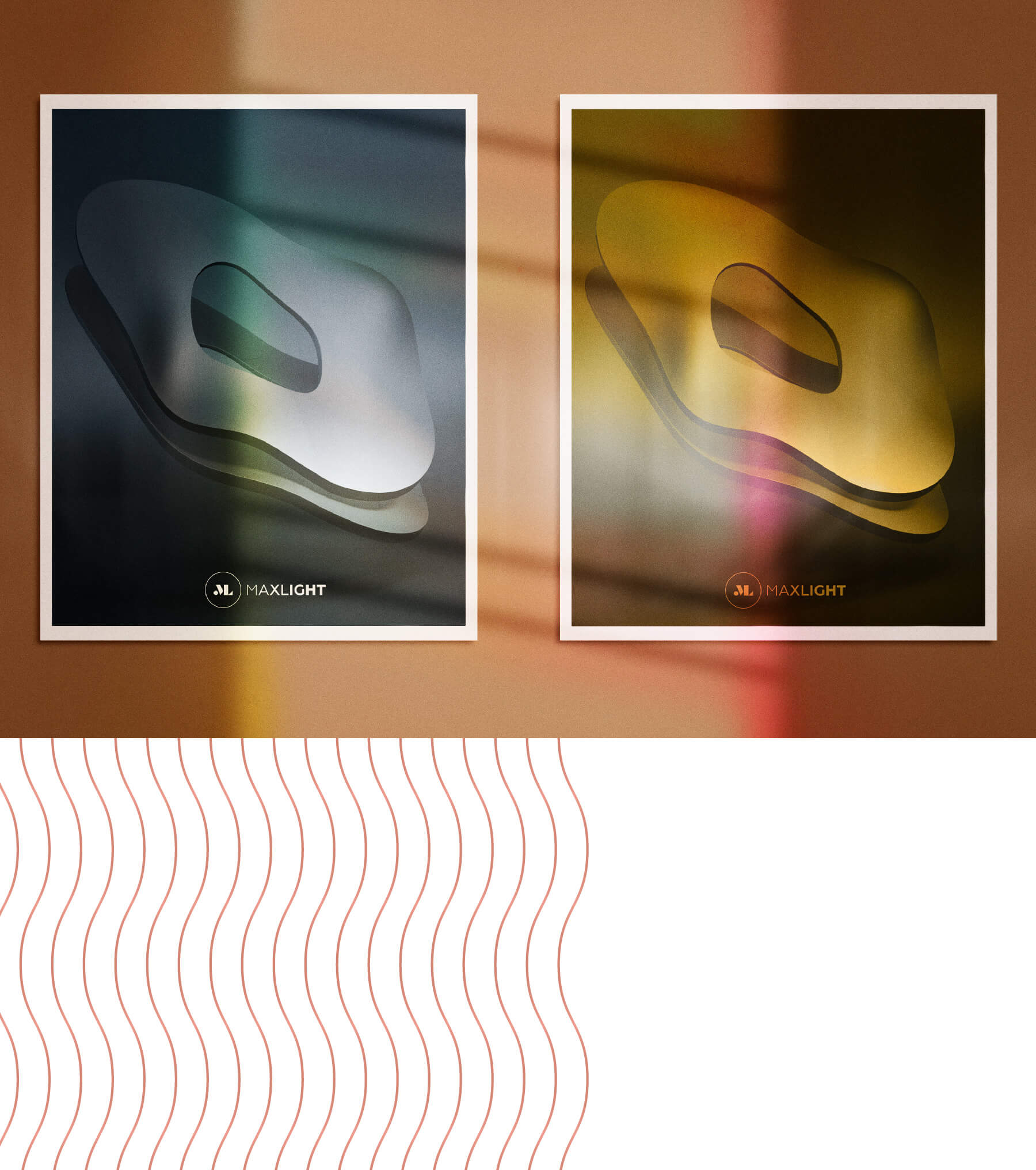
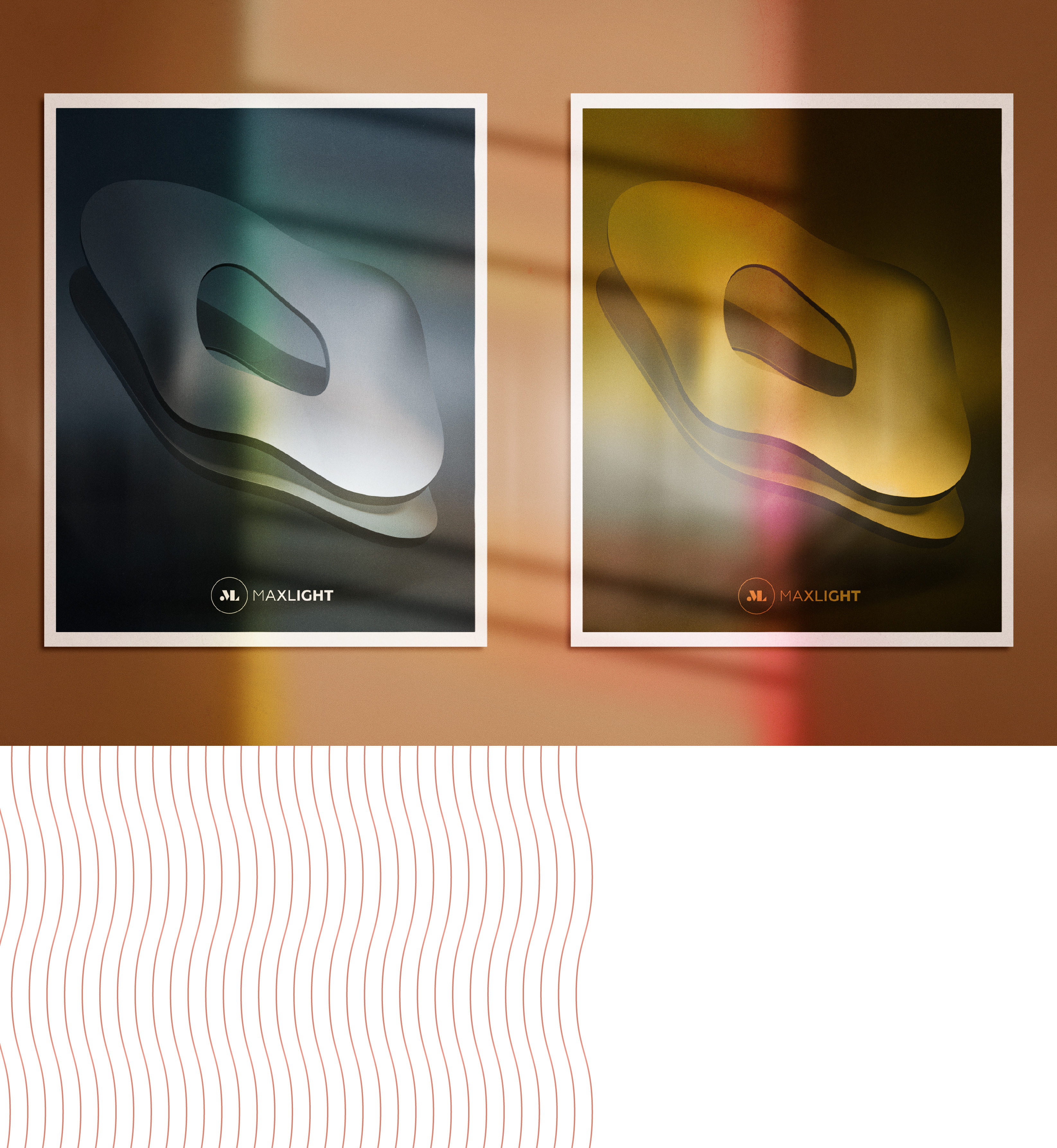
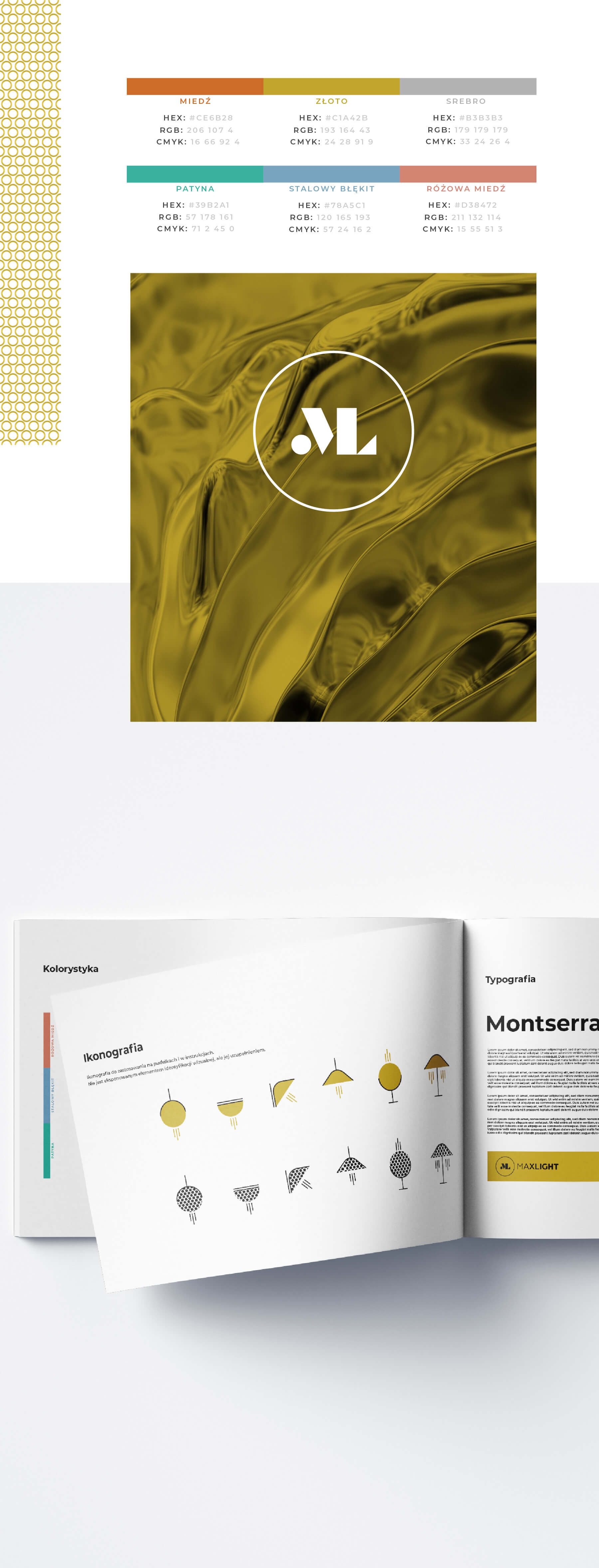
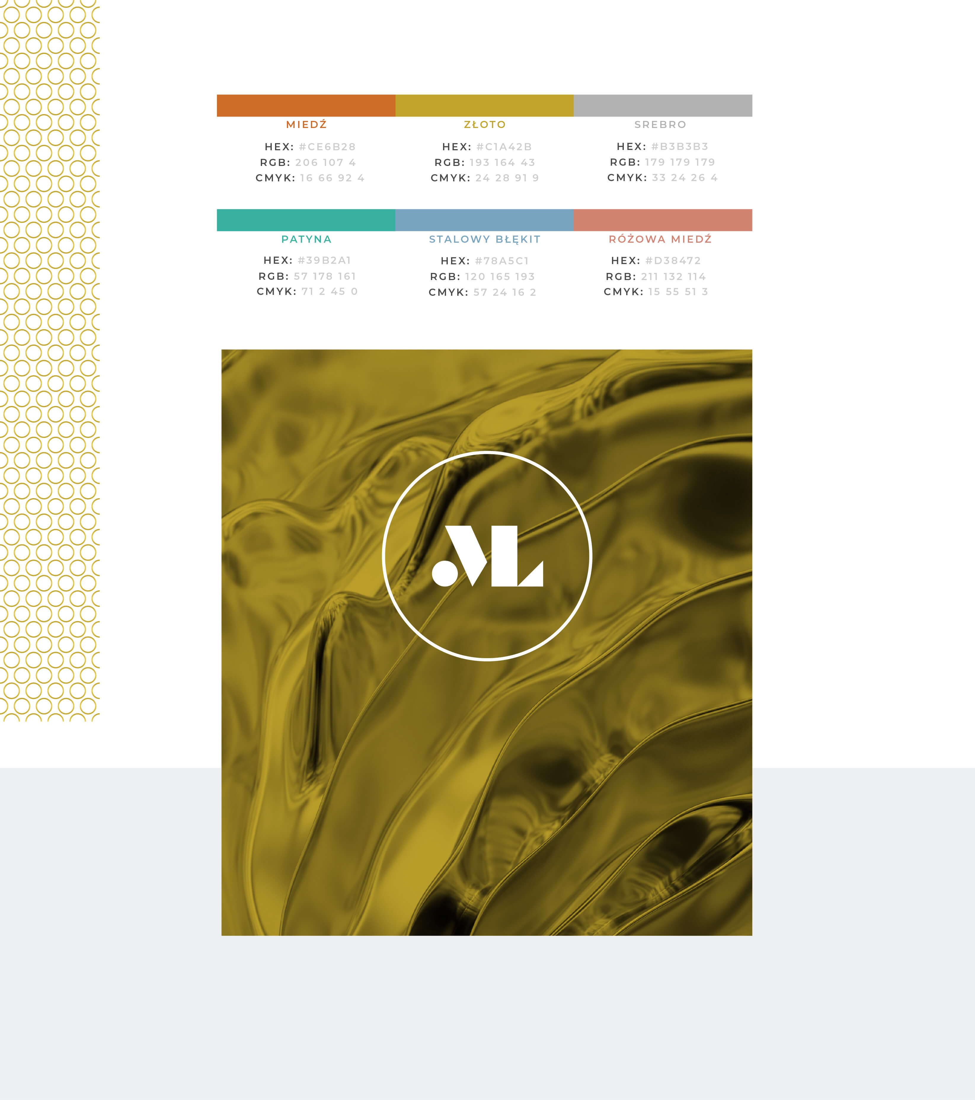
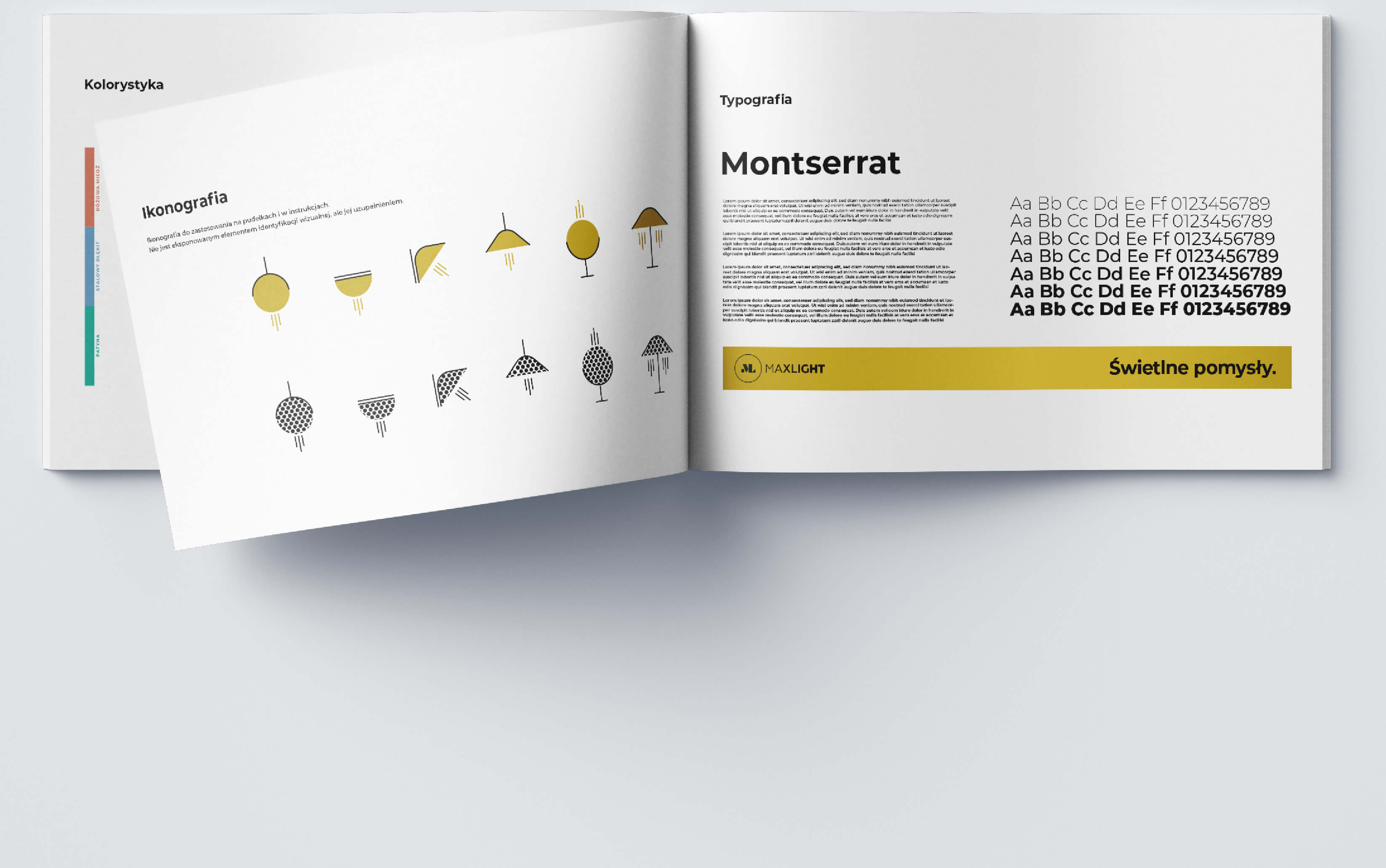
Palette based on metallic colors. It results directly from the idea of the brand based on motives related to light. Light reflections emphasize the mission of the brand, which, in addition to being useful, wants to be an elegant jewelery for interiors.
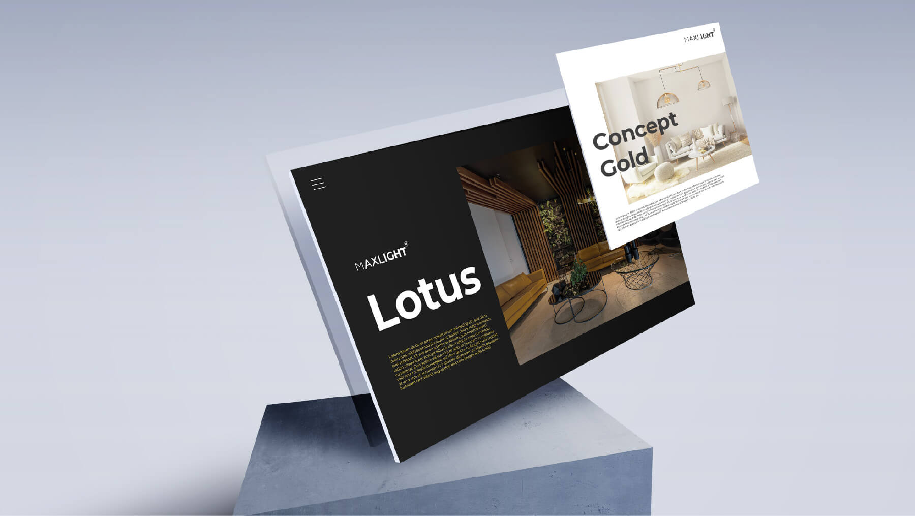
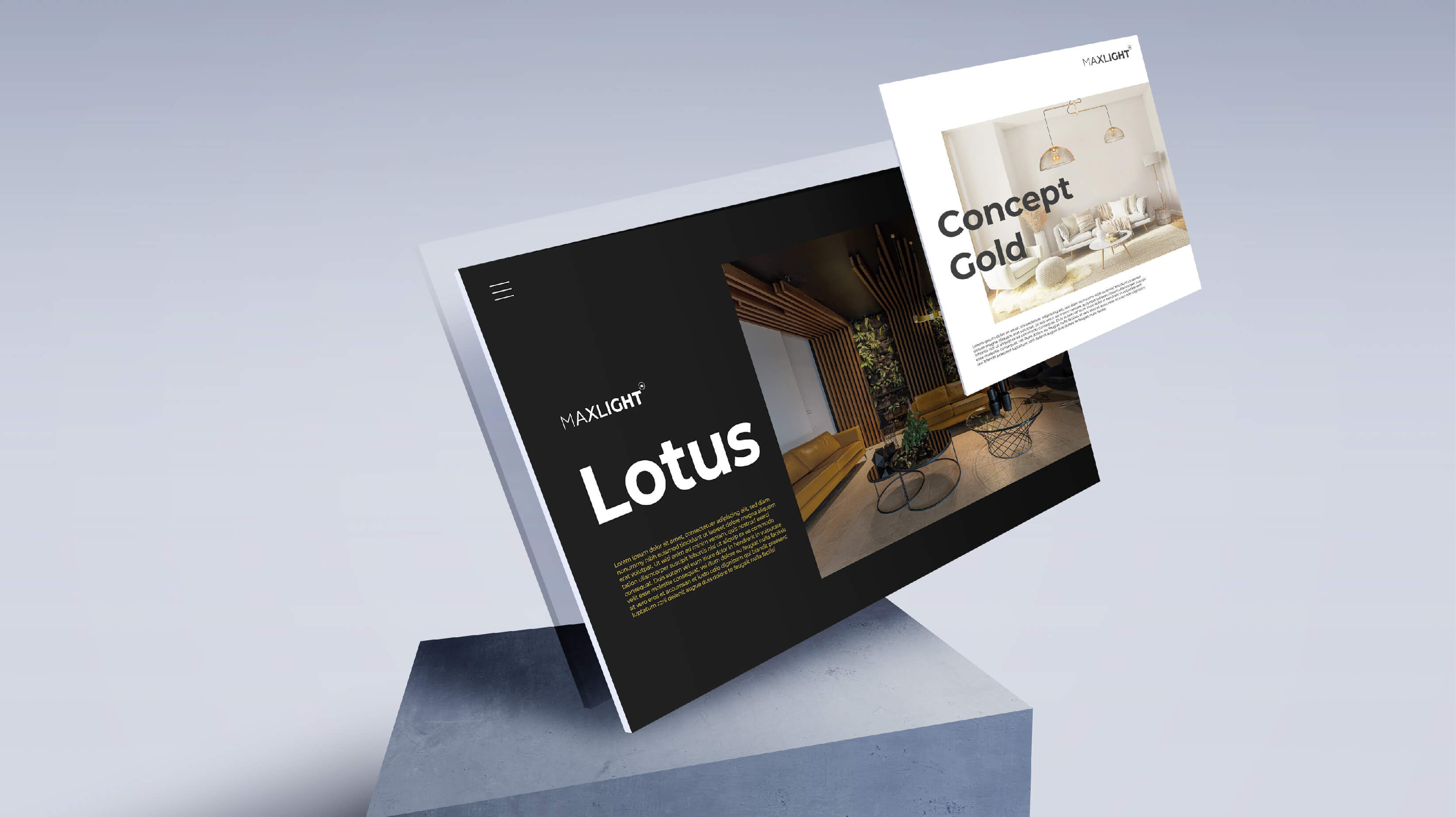
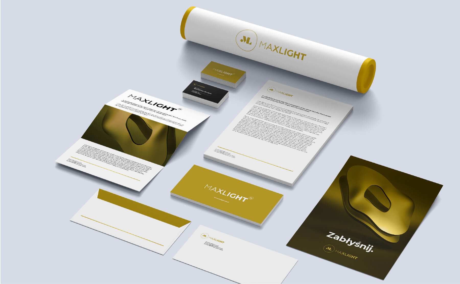
Exemplary set of materials with brand visual identification.

Do you like
what you see?
Contact us

