Warning
To enter the site you must be 18 years old.
Are you 18 years old?

Thank you for your email address, we will answer in a moment.
There was an error sending the form. Please try again in a moment.

Draw your message
You are not in the mood for writing?
Paint something and we will ask you what you like and what can we do good together!
Job offers and internships
We do not have full-time positions at the moment, but we offer paid seasonal part-time internships.
To receive notifications when applications begin, sign up to our mailing list below.
Project and its valuation
Would you like to prepare a project with us?
Tell us a little more about your idea or need.
Let's stay in touch
Give us your phone number or email address and we will contact you in less than 30 minutes!
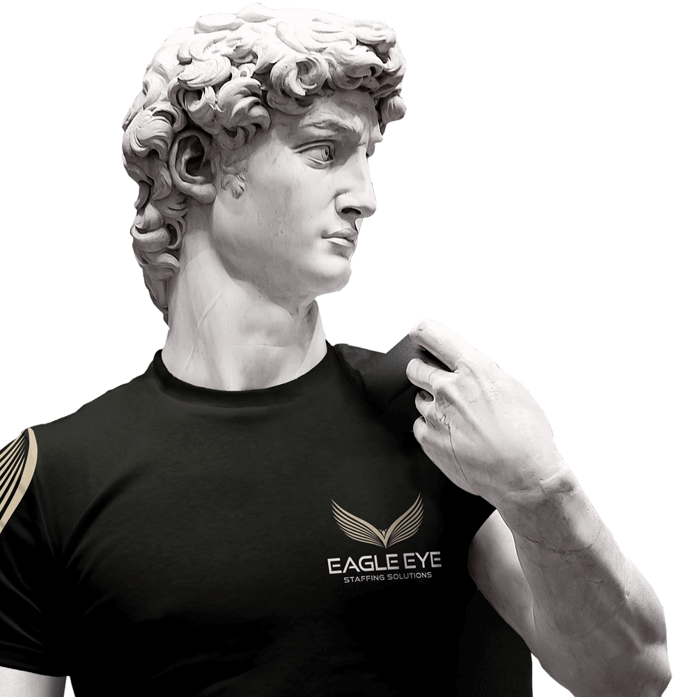
New logo for Eagle Eye Staffing Solutions
Eagle Eye Staffing Solutions is an international company based in London. It’s recruiting employees in the IT industry and has been on the market for 10 years. The new logo purpose was to illustrate their strong position on the market.
The company was looking for a strong and modern sign with new universal colors. We proposed a golden sign of an eagle with outstretched wings. It symbolizes readiness for action and a wide range of business opportunities.
Construction
signet

The company's colors reflect its personality. Eagle Eye is timeless and respected in the industry, like gold. Black represents the company's strength and strongly focused actions in business.

Typography
The font we used for logo represents the contemporary business style associated with futuristic technologies focused on the digital world.
Basic
color system
C: 25 M: 25 Y: 40 K: 0
R: 202 G: 187 B: 159
PANTONE: 7528 C
C: 0 M: 0 Y: 0 K: 100
R: 28 G: 28 B: 28
PANTONE: Black C


Do you like
what you see?
Contact us